Showing posts with label Fashion156. Show all posts

Sunday, July 28, 2013

Vote for Pedro (or me)


Image

So Fashion156 put out a call for someone to take over their blog for a week. I entered with my nerdy Sulpicia stuff, and I just received word that I'm one of the 7 finalists chosen by the Fashion156 people. Now, it's up to Fashion156's readers and Facebook fans to decide who the winner is. If you're interested in voting, go here or here and leave a comment/like for my entry...if you can guess which one is mine (hint: it's under my top secret name). Thanks!

(Photo from Florent Tosi, which you've already seen here and which I used in my submission to illustrate my Sulpicia-themed posts)


Moving pains*


So, just a quick update on the possible blog-moving. I played around with the different free themes WordPress has to offer today, and of course the one I chose that best suits the content of kOs does not allow for embedded videos in normal posts. I.e. I'd have to pay $60 a year to re-insert videos (that you can watch on the YouTubes or here for free) into old posts, as the videos that were already embedded in the original posts are now gone in the imported copies, and embedding videos in a pre-existing post is not possible. Is anyone opposed to not being able to watch videos directly on the WordPress kOs in the old posts? I can go back to any old posts that had videos to insert the URL, and perhaps should anyway since I'm sure some videos have been taken down by now. Let me know if this matters to you.

And speaking of going back, I have to go back and reformat literally every old post. In the import process, nearly all my careful formatting got lost in translation, such as specific picture-sizing and spacing inserted before/after photos and at the end of posts. I rather like the theme I was working with today (apart from the no-video nonsense) and the overall much-needed makeover, so I have already taken the time to re-edit a few pages of posts. The earliest posts though are complete disasters and not worth the work, in my opinion. So, I'm thinking I should completely delete some of the early posts from the WordPress site, and just leave them here if anyone feels the need to read them. Any thoughts? Of course, this would mean that I won't delete this site at all, but I'm already thinking that's necessary since all my references in kOs posts to other kOs posts link back here and not to the imported copies of the posts on the new WordPress site. Any thoughts/feelings/impressions are welcome.

(Photo that I had saved ages ago via Fashion156, from Parkeharrison)

*This is also posted on the Blogger site, in a slightly modified form.

Sunday, April 28, 2013

Spatial reasoning


I feel like I'm arriving quite late to the party, but I just came across a London-based designer (via Fashion156) by the name of Aitor Throup who makes (among other things) amazing pants. I.e. pants with built-in (but optional) spats. I wonder if Gary Fisher knows about Aitor. There's a lot more to be said about Aitor, but I'm off to Europe for the first time ever, and I can't concentrate on one thing for more than 5 minutes. Take care of each other, and see you in a couple weeks! Also, wear some spats if you can.


Thursday, January 3, 2013

À LA DISPOSITION


Every once and a while, I come upon a label that makes me think 'almost, but not quite'. As in, I like it, but there's something missing, something big enough to make me not post about the label. Then, in a few of these instances, I get my head out of my ass, do a bit more digging, and realize that I've come upon something great. The problem is thinking that to really like a label, I have to like every collection. And when I'm looking at the newest collection first, that's often a problem. I think that some designers feel they have more time to design what they really want to when they're starting out, resulting in a collection (i.e. often the graduate collection) full of show-stopping pieces. Then, when they start gaining more attention and buyers, there's the pressure of sticking to the fashion week schedule, creating not only two collections, but complete collections with multiple pieces that haven't each been obsessed about for months or even years. When this shift occurs and sacrifices have to be made, in my opinion the best thing to focus on is not a collection of show-stopping pieces, but that one particular show-stopping element that can be repeated throughout the collection. It becomes not about creating a collection full of signature pieces, but about experimenting with that signature detail or two, and seeing how it can be translated in various different pieces. This is how I've interpreted my quick retrograde tour of today's find, À LA DISPOSITION, a London-based label from married duo Daniel and Lynda (née Cohen) Kinne. The most recent collection (S/S 13) of this avant-garde womenswear label definitely caught my attention with the title ('M!sf!t Toys') and the layered rectangles and other geometric/3D details in most of the pieces (see below). Yet the collection didn't quite do it for me...


But, after at look at the Kinnes' earlier work, the collection makes a lot more sense. A look at the 2009-10 collections reveals the Kinnes' affinity to avant-garde officewear, featuring unexpected shapes in basic pieces (for example, the F/W 09 look in the top photo) and plenty of volume (particularly seen in the brilliant 'balloon dress' from the S/S 09 collection entitled 'lighterthanair'; see below).


This aesthetic is then transformed into a fully-realized collection, F/W 11/12 'Utopian Aviary', where each piece is inspired by and named after a bird (see below). 


Perhaps my head is still up my you-know-what, but these earlier designs as a collective whole seem to capture the aesthetic of À LA DISPOSITION more than a quick glance at the M!sf!t collection. Or, rather, they exhibit the fact that there is more often than not a historical context that must be considered in looking at a designer's work, and so a collection should not be viewed in isolation. In any event, how I found this label was through the photo below in 
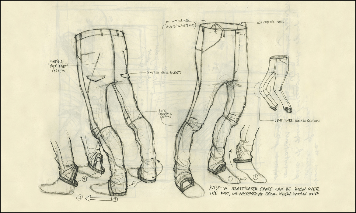
Fashion156's preview of the upcoming menswear A/W 13 collections. Meaning that the Kinnes have a lot more up their sleeve, and their story is about to get a lot more interesting...


(Runway photos via UK Vogue, other photos besides the Fashion156 one via Facebook)


Sunday, April 22, 2012

William Watson


Seriously, guys get all the fun when it comes to pants. The latest exhibit I'd like to bring forward for my case is the Fall 2012 collection of one English-born and Brooklyn-based William Watson (found via a brief mention on Fashion156). Might I also direct your attention to the 3D collars, architectural elbow details, and hidden pockets. Oh sorry, I meant HIDDEN POCKETS IN A WHITE BUTTON DOWN! Again: seriously. William, you have given me no other choice than to come back to NY to try and get to the bottom of this pant-and-other-tailored-goods disparity between the sexes. How does mid-June work for you?


By the way, you ought to read the interview with William on The Dandy Project, entitled 'English Licorice', which was the source of Fashion156's mention. It begins as follows: 
In the gum ball machine of heritage Americana and Milanese tailoring permutations that were the trade shows a few months ago, William Watson was a licorice jawbreaker...
 Brilliant writing, seeing as I never actually liked licorice anything before, and am now reconsidering...

(Photos via William Watson NYC Facebook)


Friday, March 2, 2012

Aganovich, A/W 12/13


Thanks to Fashion156, I have now been introduced to a label called Aganovich, and a site called Fashionising.com. I actually think I've seen links to Fashionising.com in the past, but never realized it is a treasure trove during the Fashion Weeks, as it includes designers that do not make it onto UK Vogue.com or Style.com. And since I've been so utterly bored with the vast majority of shows this season (please don't fail me YOHJ JUN VIV!), I get perhaps even more excited than usual when I see a show that is actually doing something interesting. Such as Aganovich. This London-based (and Paris-showing) label is from Central Saint Martins grad Nana Aganovich and writer/conceptual designer Brooke Taylor. While I'd prefer all of these pieces to be in black, the white nicely accentuates the seam detailing, angled sleeve shape, and neoprene-stiff fabrics used in this A/W 12/13 collection. If you flip through all the photos, you'll notice that Nana was likely inspired at least in part by nuns for both her palette and her lovely demure dresses. (Edit: Apparently the collection was inspired by icebergs and avalanches. Same difference.)


Tuesday, January 31, 2012

Natsumi Zama


Natsumi Zama's '2 to 3' collection (found via Fashion156) immediately brings to mind a video I watched over and over in my parents' kitchen of Julian Roberts performing his subtraction cutting to a live audience: from a two dimensional rectangle of fabric, comes a three dimensional draped creation. Natsumi's collection, however, brings with it a reverence for that two dimensional rectangle of fabric. At first glance, Natsumi seems to put the finished piece on display by mounting it directly onto the flat piece of material. However, when that flat piece is allowed to hang and drape rather comfortingly around the finished piece, it becomes obvious that it is the flat piece that is on display; the frame is the centre of attention, not the picture. Furthermore, not wanting to cut away at the edges, as with normal pattern cutting, or cut away at the centre, as with Julian's method, the two dimensional rectangle of fabric is left relatively untouched, and yet is given the chance to experience a new dimension. Sounds rather romantic, no?


Tuesday, June 7, 2011

Dack and Cover


Bringing me out of my bored-with-fashion phase for at least a brief moment is London-based designer Manuela Dack, specifically with her S/S 11 jacket (which was also a part of her graduate collection). I believe that the main part of it is leather, and so I'd obviously prefer a heavy canvas or waxed cotton instead. What I love about it though is the very unexpected juxtaposition of the pleated chiffon with the heavy material and zippers normally found in a biker jacket. I've always like the look of the stylized biker jacket (i.e. one found in a boutique and not on an actual biker), but I know myself well enough to have never even tried one on. However, if given the opportunity to get a leather-free Manuela Dack version... Anyway, I found Manuela via Fashion156, but apparently she's been all over Style Bubble as far back as July of last year. So now I'm wondering what that says about my (changing) fashion sensibilities and/or my state of mind. Perhaps I should rethink my whole never-getting-my-driver's-license-thing and start shopping around for a motorcycle, or at least the more chiffon friendly Vespa. Or, maybe I should actually pay attention to the blogs that I supposedly 'read'...


Tuesday, May 17, 2011

Et tulle, Brooke Shaden?*


I don't often pay attention to photographers, as I'm a greater fan of the lookbook style of fashion pictures that clearly showcases how a piece of clothing looks on a body, rather than the editorial style that showcases the body and surroundings with a little bit of clothing in the mix. A post on Fashion156 today, however, made me look through every single photo in the gallery of LA-based photographer Brooke Shaden. Brooke's work is instantly eye-catching from the square format and almost painting-like style, to the ethereal worlds created by the (often underwater) settings, clothing, beautiful models, and dark mood. If I had a label that included flowy, billowy pieces, Brooke is definitely the photographer I'd want for an editorial photo shoot. Having said that, the photo I've picked here (and please do yourself a favor and look through each and every one of them on Brooke's site) doesn't showcase billowy clothing, but rather a) what I'd do on a day off (or every day) if I lived in the middle of a deserted wood (it may be of use to you to know that I often imitated Jodie Foster's Nell when I was younger), and b) the article of clothing I've been strangely drawn to for quite some time but have never purchased, being the tulle skirt. Especially with my style changing to a more pared-down minimalist look lately, I can't picture where I could wear a tulle skirt (other than a deserted wood). However, I will likely continue to want one, partially thanks to the fact that I would want to be a ballerina in another life, and partially thanks to Carrie Bradshaw. At any rate, I think this black sheer number by Peeko Apparel would fit more easily into my wardrobe than a full-out tulle skirt, if only as a layer over top of, say, my beloved mydearthing Panel Skirt...


Anyway, back to Brooke. Brooke just had her first fashion shoot (which completely surprises me) with Etsyian Pooka Queen. The resulting photos are not yet up in the Pooka Queen shop, but the upcycled/recycled shrugs and avant garde headpieces deserve a look. I personally want to buy this amazing chain and epaulette piece (the designer behind Pooka Queen has a BFA in metal smithing and jewelry). Wouldn't it look perfect with a tulle skirt?


And, back to Brooke again, because I love this photo. 


If you want to see some more of Brooke's work and read some behind-the-scenes thoughts (as well as info about her photography workshops), do visit her blog. It's pretty great.

*My goodness, I'm a nerd. 


Saturday, April 23, 2011

Cover of Life


Well here's a name I haven't heard for eons. Well, nearly two years, anyway. Remember those layered trousers I was all about when NJAL's The Shop was still shiny and new? Well, Fashion156 today reminded me of their label, being Ethosens from Japanese designer Yui Hashimoto. I seem to think that they didn't have a website up and running when I was pining after those trousers, since I don't remember all those scrolling lookbooks, or the fact that each year has one name for both the A/W and following S/S collections. It's rather a good idea, I think, as it allows the designer to just work with one theme for the year, and yet be able to make season appropriate pieces within that construct. Anyway, the title or theme for the A/W 10/11 and S/S 11 seasons is 'Cover of Life', with the tagline 'What wraps you?'. Both seasons are full of minimalist pieces that are everyday wearable, especially for the more laid back gentlemen who can pull of wearing a pair of sweats in public. What I enjoy so much about Ethosens, however, is the unexpected reconfiguration of the suit to create new basic menswear pieces. For instance, the trench onesie. Now, I think it would be horrible to ask a guy to wear it with a pair of tights or leggings, like in the above picture on the left. However, when paired with a pair of pants underneath like on the right, I think it takes away at least most of the unflattering aspects of the onesie, and makes it conceivable that someone older than ten and not on the runway or at a fashion week would wear it. 


Not convinced? Yeah, I'm not really either. But I think you'll easily enjoy the other pieces pictured here. For instance, the outfit on the left that, at first glance, seems to include pants with a layered top portion, but then upon closer look reveals itself to be a bit of trompe l'oeil on the bottom of the shirt. Or the mid-length coat/structured smoking jacket that was a suit jacket and pair of pants in a previous life. The pieces below are pretty sweet too. But I really hope to never again see a guy in tights off the stage/ice/bike.


Tuesday, April 5, 2011

Future Classics


As opposed to my post yesterday, every once in a while I come upon a designer whose work makes me wish I could push a rewind button and go back a couple of years. Because often, if I see a name in close succession on two or more blogs that I frequent, I think that they must be well known, and so I don't want to bother looking closer at them for lack of want of getting caught up in the broken record that is often the fashion blogosphere. Such is the case with a London-based designer Julie Wilkins' label called Future Classics, which I've seen mentioned multiple times on all my big three daily reads, being Kingdom of Style, Style Bubble, and Fashion156. But today's Fashion156 FC mention made me think, 'okay, let's see what all the hullabaloo is about'. And my goodness, what a hullabaloo Future Classics deserves. First off, the problem may have been that I wasn't too keen on the presentation/styling of the pieces themselves in the lookbooks or runway photos, because I instantly loved all the pieces in the FC online shop, which are simply photographed on a dress form. Somehow presenting them in only two dimensions (especially when paired with their line drawings) properly showcases the essentialness of the basic knit pieces (above), and how the dresses in particular blend what I love most about Gary Graham's romantic/vintage-inspired looks and soft tailoring sensibilities with complexgeometries' effortless draping and convertible nature (below). Really, I never gathered from the lookbooks or runway photos that Future Classics is basically the British poster child for deconstructed and convertible clothing. 


Secondly (umm, I think I was counting hullabaloo-worthy reasons), maybe my mind knew that the FC pieces were way beyond my budget, as the regular prices are rather cruel for both lines (being the main FC line, and the FC Dress line). However, upon finally looking into the label, I found that the previous collection (A/W 10, which is what you see in this post, and which I love more than the current collection) is on sale at over 50% off the regular price. Sure, I still can't afford anything, especially given that I'm wanting to return to school about a year sooner than planned AND I need to prepare for the inevitable reoccurrence of this past Friday, where I spilled coffee all over my laptop and almost lost it if it were not for my man and a fan. But I digress (as I do). In short, I need to get working on those new listings for my shop, as the boiled fine wool FC Abstract Pod Soft Jacket (below; make sure you scroll down to see the drawing for the full effect) is calling my name. Loudly.


P.S. Please excuse me if this post looks wonky on your screen. I really wanted to include the drawings, but the sizing difference between them and the photos wouldn't allow for proper formatting. You should see the drawing plus two images of the same piece in one line.